UI | Interactive E-book Design: The Vision of China
September 04, 2020
UI | Interactive E-book Design: The Vision of China
September 04, 2020

Designing interactive books
(CCT450 at University of Toronto)
Interactive book design
Pages | Adobe Illustrator
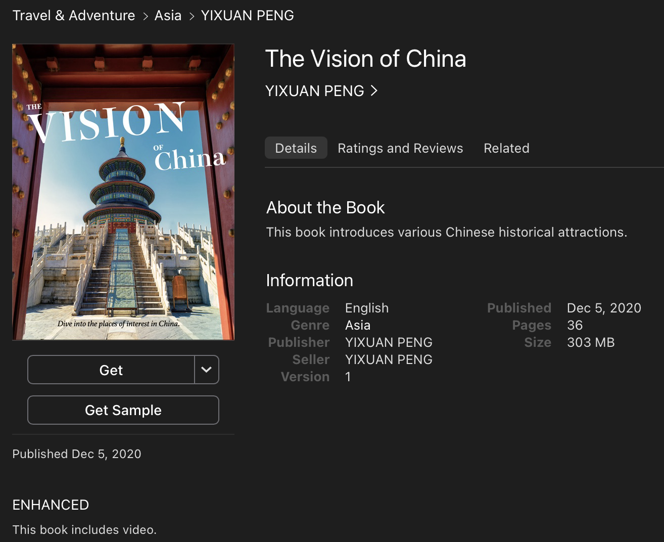
Book Title: The Vision of China
Publication: Apple Books.
Link: https://books.apple.com/ca/book/the-vision-of-china/id1543519392
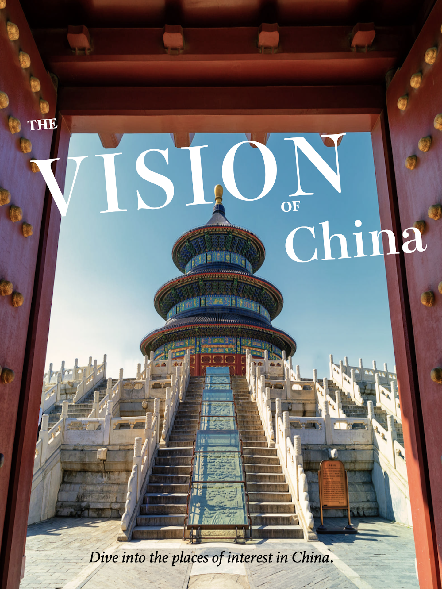
Slogan of the book: Dive into the places of interest in China
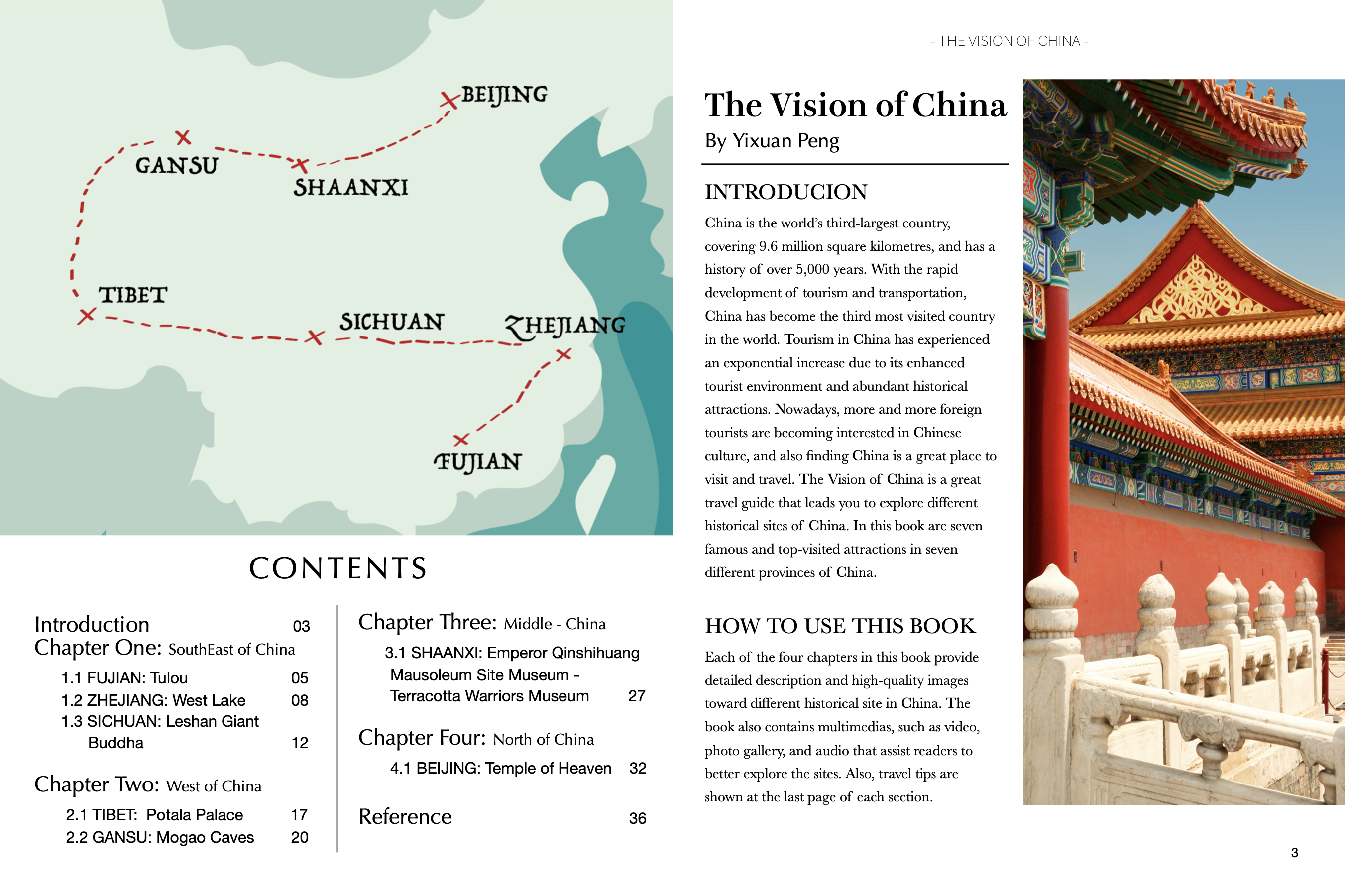
The genre of the book: Interactive travel guide for people who are interested in Chinese culture and historical sites. It provides detailed information toward different historical sites in China and interactive features that help reader better understand the attractions.
Target audience: Travel enthusiast and people who are planning to visit China. (Ages between 14 - 30)
Content structure: Chapters and sections.
With the rapid development of tourism, nowadays, more and more people choose to travel to China. Therefore, it is a good opportunity to create a unique travel guide for people to better understand China's historical sites before visiting the sites. Recently, I am also reading some travel magazines such as the "Travel+ Leisure" and "Let's travel, which provide me a lot of ideas and inspirations for my initial concept's design.
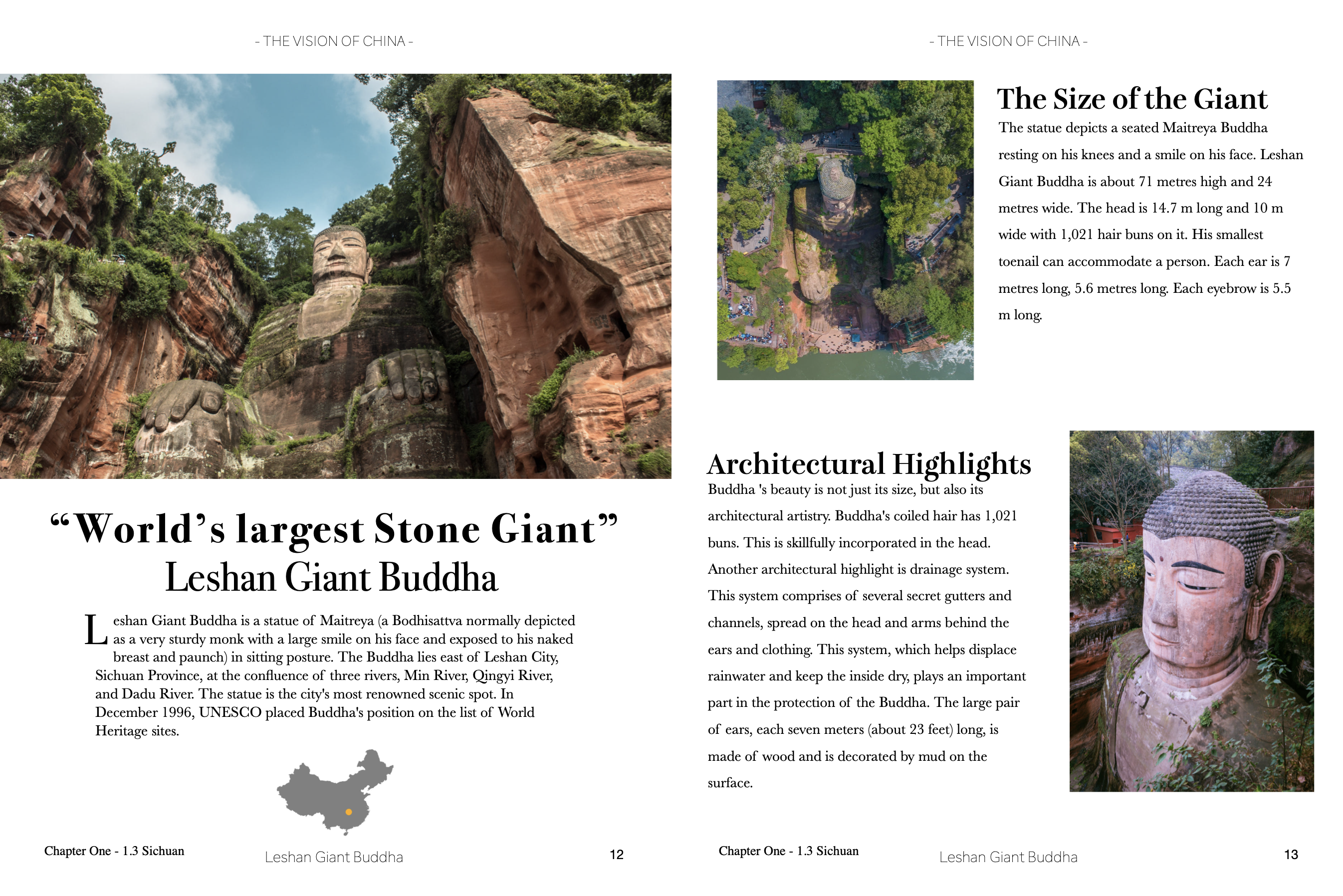
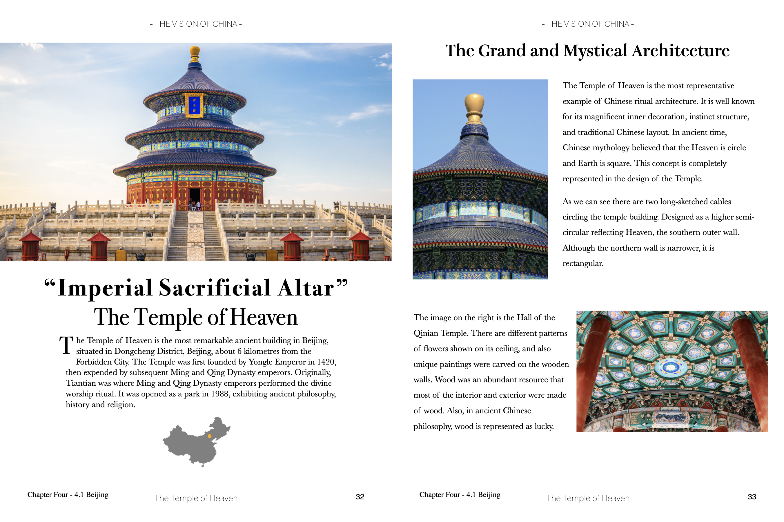
- The users of this book can learn different Chinese historical sites through detailed descriptions and high-quality images.
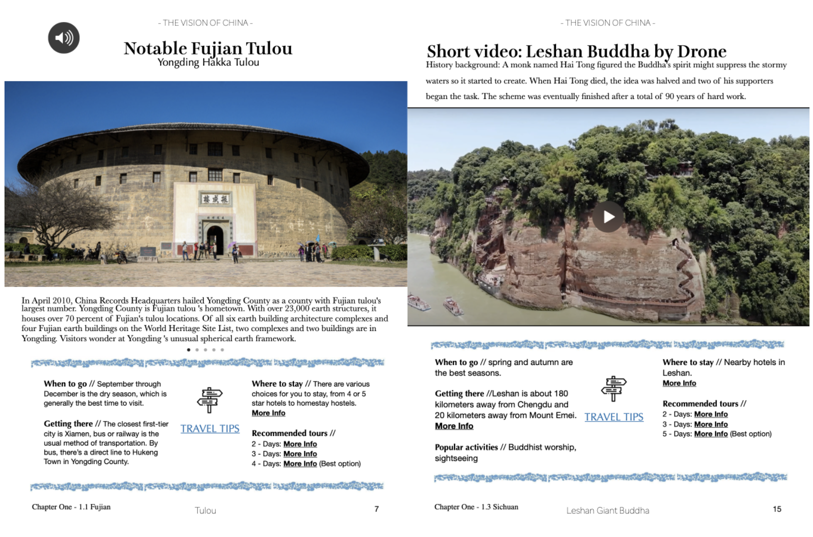
- The book contains various multimedia, such as video, recording audio, and hyperlink, which help users further understand the background and changes of the sites.
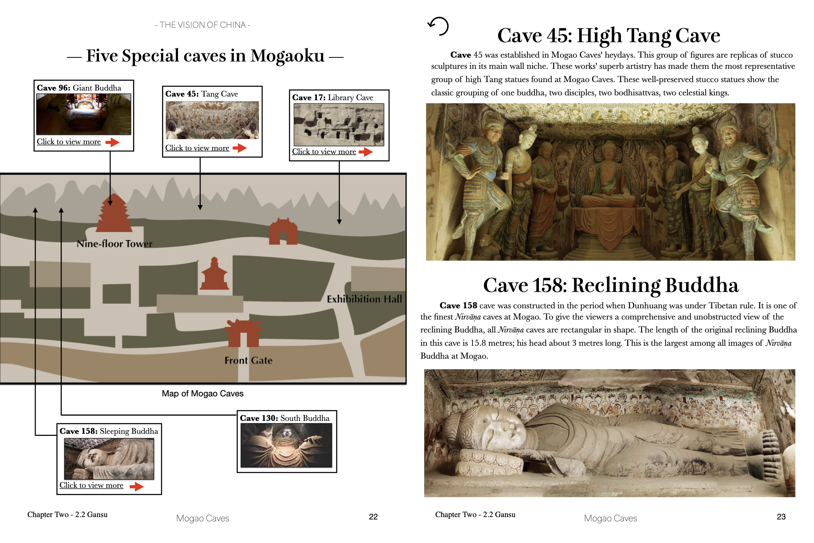
- Furthermore, the book also provides interactive features, such as interactive texts, icons, and photo galleries that users can tap to view more relevant information.

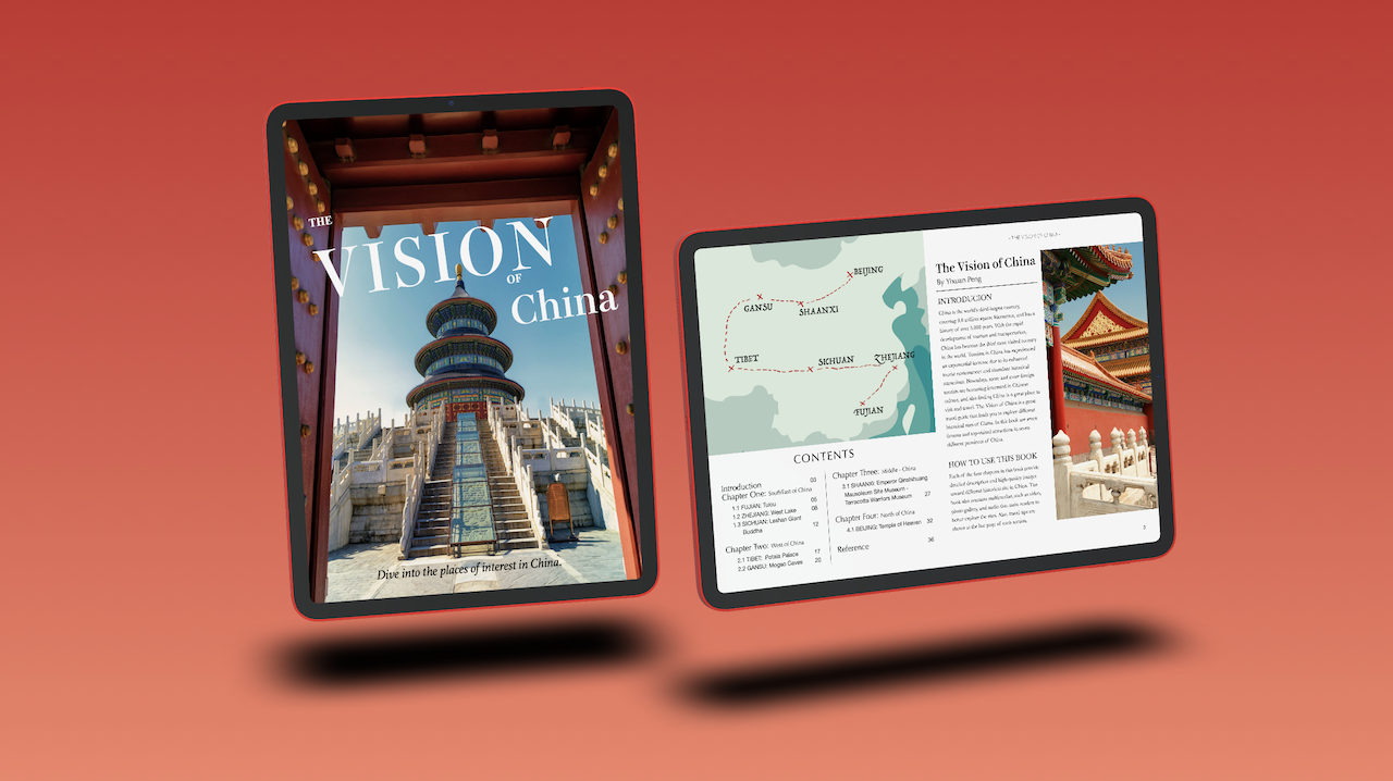
The style of the cover page is different than other normal travel books. It seems more like a travel guide with a feeling of modern and splendid. The symmetrical image behind the background illustrates the front gate of the site "The Temple of Heaven." It provides users an imagination that they are actually standing in front of the site. The rectangle structure of the gate creates a frame that attracts the reader's attention to the title. The title's design is pretty unique that it is tilted and placed at the top of the frame. In order to emphasize the title's name, both the font of the words "Vision" and "China" are set larger and bolder than the words "The" and "of," also the combination of the white color of the text and the blue sky of the image makes the title more comprehensive with the background.
